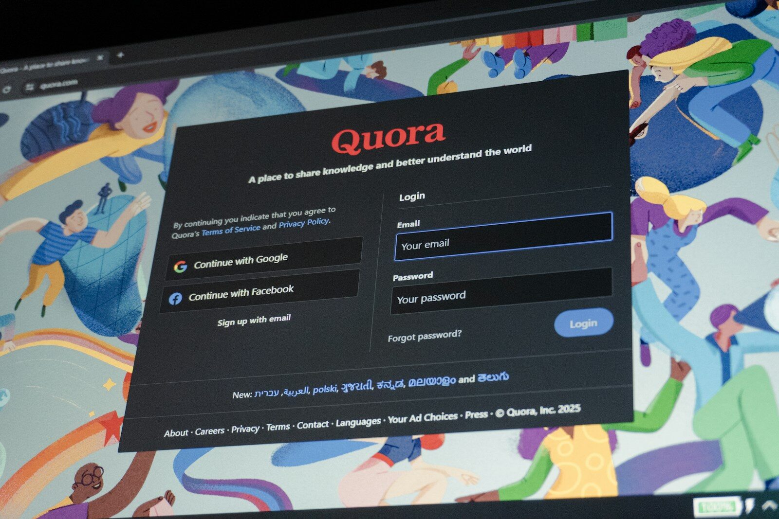
Most of us have landed on a website that looked polished at first glance, then turned out to be oddly hard work. Tiny pale text, buttons with no clear label, menus that vanish on mobile, forms that seem built to try your patience. It’s tempting to treat these as minor annoyances. In reality, they’re often signs that a site was built with little thought for accessibility.
That matters for a simple reason: the internet is public space now. If a website is needlessly difficult to use, people don’t just bounce off it, they’re shut out. Accessibility is often framed as a technical or legal issue, but it’s also a matter of basic courtesy. Can someone navigate without a mouse? Can they follow the page structure with a screen reader? Can they still read the content in poor light, on a cracked phone screen, or when they’re simply tired?
If you’re not sure what good practice looks like, a practical website accessibility checklist is a useful place to start. Not because every site owner needs to become an expert overnight, but because accessibility usually improves the experience for everyone, not only disabled users. Clearer headings, better links and stronger contrast help all readers move through a page with less friction.
Small details, big difference
Accessibility improvements are often unglamorous, which is partly why they get ignored. But these are the details people actually notice when using a site.
- Descriptive link text instead of “click here”
- Form fields with proper labels
- Alt text for meaningful images
- Logical heading structure
- Sufficient colour contrast
There’s nothing especially trendy about any of this. That’s the point. A good website should not make visitors work harder than necessary. Accessibility is less about box-ticking and more about taking other people seriously. In an online world full of noise and clutter, that’s still a quietly radical idea.
Photo by Zulfugar Karimov.